
How to Hang Funny Wall Art Without Making Your Home Look Cluttered
- Naughty Gnome

- Oct 15, 2025
- 6 min read
Funny wall art can bring personality into a room fast. It can take a basic space and make it feel like someone actually lives there instead of just sleeping in it. The challenge comes when the humor starts to overwhelm the room. That is when things look cluttered instead of clever. I have learned that the difference between charming and chaotic is not the art itself but the way it is hung. Humor works best when it is placed with a little editing and intention. When you hang funny wall art with a plan it becomes a highlight not a distraction. It becomes a confidence move instead of visual noise.
Step 1: Choose the Right Wall and Eye Level
Start with a wall where your guests naturally sit or walk by. Think behind the sofa, by the reading chair or just above the console table in the entry hall. Keep the center of the art at eye level for the average person about 57 inches from the floor. This is what I follow when I install pieces and it keeps everything looking grounded.

One favorite in my collection is the Moose Maude Poster on Canvas. It has bold lines and a playful character so I hung it in the hallway where it greets people. It works because the piece itself is the humor and the wall around it stays simple. Hallways are great for funny art because they are transition spaces. People are not sitting down or focusing on screens. They are moving through the space which gives the art a quick moment to land. Humor reads instantly when it is placed in a spot where you are passing by. A hallway becomes a little reveal. It feels like a personality hint instead of a main room feature. Another advantage is that hallways usually have clean narrow walls. There are not a lot of competing elements. No TV. No shelving. No big furniture line. That simplicity lets the humor shine without any noise. The wall becomes a perfect frame for the joke. If you pick a bold character like Moose Maude the art becomes a greeting and a smile at the same time.
Step 2: Balance Size with Furniture and Wall Space
Funny posters often come in standard sizes but what matters most is how they relate to the furniture in front of them. If you have a three seat sofa pick art that is no wider than two thirds of the sofa. Leave some breathing room.
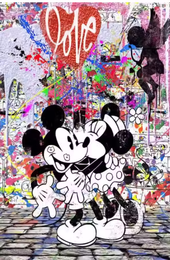
I once hung the Mickey Mouse and Minnie Mouse Pop Art Poster in a size that was too large for the space and it immediately took over the whole room instead of blending in. Fixing that meant replacing a frame and scaling down the image. It surprised me how much better it looked once the proportions made sense. Big loud humor can be great but it still needs the right scale to feel intentional.
If your furniture is low and long hang the art so it aligns with the top of the furniture. That keeps the visual line clean and makes the art feel like part of the room instead of floating in space. If you have no furniture under it treat it like a gallery wall. Cluster pieces with equal spacing and anchor the group with one common visual line. That way the room feels cohesive and the funny art still feels like part of the design instead of a random sticker on a wall.

Step 3: Match the Art’s Tone to the Room’s Mood
You want the humor to feel natural in the space. If the room is elegant or minimal pick a poster that has a witty twist but still polished. The Mona Lisa and Van Gogh Poster with their cigarettes does just that. It riffs on classic art but gives the room that extra wink. I hung it above a clients desk once because it asks a question just by being there. Are you taking this too seriously. It is a piece that lets you be playful without turning the whole room into a circus. It is like saying yes I respect fine art but I also like to have a little fun. People notice it and usually smile but they do not feel overwhelmed by it. It becomes a tiny personality confession that still keeps the room chic. It is perfect for someone who wants that little moment of rebellion in a room that is otherwise clean neat and grown up. That contrast is what makes it land.
Step 4: Keep the Surroundings Simple
Funny wall art works best when the surroundings are clean. Too many colors patterns and picture frames will take away from the impact. Leave empty space around the art. I always leave at least four to five inches clear around the edges of the poster unless I am creating a full gallery wall. Make sure the lighting is not competing. Natural light or a single picture light above the frame is sufficient. The goal is that the joke in the art lands first then the style speaks second.

In a louder room like a media space or game room you can go big and bold. The Frank Sinatra Mugshot has attitude so I placed it where conversation naturally happens behind the bar cart. It becomes a piece that invites a drink and a story.
Funny wall art works best when the surroundings are clean. Too many colors patterns and picture frames will take away from the impact. Leave empty space around the art. I always leave at least four to five inches clear around the edges of the piece unless I am creating a full gallery wall.
Make sure the lighting is not competing. Natural light or a single picture light above the frame is sufficient. The goal is that the joke in the art lands first then the style speaks second.
Step 5: Use Hung Height Anchors or Frame Grouping
If you want to hang multiple pieces consider using one common anchor point for alignment either the top edges or the centers. If the art is funny but you treat it like high design you maintain balance.
For example if you have the Moose Maude piece on one wall and later add the Mona and Van Gogh you can align their centers horizontally so they link visually even though the styles differ. This idea has worked for me in a compact room. The art looks connected not random.
When you follow these steps your funny wall art becomes part of the room not a free floating afterthought. You get personality without the clutter. Whether you pick the big bold Sinatra mugshot, the clever Van Gogh joke, the playful Moose Maude, or the pop art Mouse pair you will know it was hung with intention.
If you are ready for more fun wall art and creative posters check out our full collection at Naughty Gnome.
FAQ
How do I pick the right size poster for a small wall?
Measure the wall space first. Use art roughly half to two thirds the width of the furniture beneath it or leave at least six inches on each side for breathing room. Avoid going full width.
Can I hang funny posters in a professional space like an office?
Yes. Choose a piece that has humor but still reads as well designed. A smart cheeky print can work in a conference room or small office if the frame and lighting keep it sophisticated.
Do I need to frame all posters or is hanging unframed okay?
Both work but framing adds polish. If the poster is bold you can skip the frame and mount it with clips for a modern look. In more formal rooms I prefer simple black or white frames to let the humor stand out rather than the frame.
Is it okay to mix serious art and funny wall art?
Absolutely. Mixing shows confidence. You can balance a serious piece with a funny one to keep the mood textured. Just keep the surroundings calm and the contrast will make each piece stronger.
Can I rotate posters seasonally or keep the same one year round?
Either works. Rotating keeps things fresh and gives you an opportunity to change the mood. Keeping one year round means your space has a stable personality. Choose what matches your lifestyle and swap when you feel like it.


Comments